
Craft My Plate is a first of its kind bulk food ordering platform designed for events and celebrations across India. I led the end-to-end Product design, building a scalable, accessible, and intuitive app experience from scratch.


Lead Product Designer
UX UI designers,
Logo designer,
Back-end Developer,
Stakeholders
7 Months
Figma (design & prototyping, Presentation),
Zoom(Collaboration),
Slack(Collaboration),
Google Docs
Imagine ordering a feast without pulling an all-nighter on Excel. Craft My Plate is India’s first real-time bulk-food ordering app for any huge family dinners to full-blown conferences. As Lead Designer, I built everything from our “round-plate” icons to the live pricing slider, making guests count and budgets both thing of beauty.
Led stakeholder interviews and competitor benchmarking with strong communication and collaboration skills to align business objectives with user needs, while prioritizing features based on strategic goals and user insights.
Design System creation Lexend typography + custom icons that look like perfectly rolled rotis
Conducted Guerrilla User Research “kitchen-table” interviews & surveys, then folded insights into personas and flows
Led the design and iteration of high-fidelity prototypes for key features, using problem-solving and creativity to refine elements like event creation, food selection, budgeting, and order tracking, optimizing user experience across the product
When Catering Feels Like Defusing a Bomb
Pricing is unclear and inconsistent for bulk orders
Users must coordinate across multiple vendors and platforms
Customization for dietary needs, guest count, and event type is tedious
There’s a lack of tech-enabled platforms tailored to bulk or event-based food planning
One App to Rule the Buffet
Live-price slider to see your total plate cost dance as you add guests
Drag-and-drop menu builder for cuisine, spice, diet filters all in one place
Event dashboard for budget tracker + order history so you can nap, not panic
Secure checkout + 24×7 chat support, because no one wants surprise fees
Below links will take you to the live site/app:


Proof in the pudding
50% faster event setup (users literally high-fived us)
70% drop in “Where’s my invoice?!” tickets
200+ sign-ups in week one, word spread faster than biryani aromas
30% quicker Dev handoffs our components were ready (Planning saves time)
Flexible Menu Customization
Event hosts require the ability to tailor their catering options to suit specific dietary needs, guest preferences, and event types. This includes selecting cuisines, adjusting spice levels, and accommodating dietary restrictions.
Clear and Customizable Pricing
Users need a platform where they can easily understand and customize their catering order pricing based on event size, menu, and guest count, without feeling confused by hidden costs.
Intuitive Event Planning and Management
Users want a straightforward, all-in-one platform to manage event details, from menu selection to order tracking, with minimal friction and maximum control.
Simplified Bulk Food Ordering
The business aims to streamline the fragmented and complex process of ordering catering for events, offering a more efficient way for users to customize menus, track orders, and manage event details.
Dynamic Pricing Model
Craft My Plate's business model is built on dynamic pricing based on event size, menu selections, and guest count. This flexibility is key to serving a wide range of events, from intimate gatherings to large-scale celebrations.
Seamless Event Management
The platform needs to enable users to easily manage their entire event from one place, including menu selection, budget tracking, and guest coordination, making it easier to compete in the crowded food-tech industry.

Coffee with both founders over Zoom, dug into their vision, must-have features, brand tone, and growth roadmap. To make sure our “recipe” matched the startup’s appetite for scale, uniqueness, and user delight.
Core USP
Real-time bulk pricing
Non-negotiables
Simple guest count flexibility choice for users, clear fee breakdowns, scalable components
Long - Term scalability
Plan or expectation on how their product will evolve to support growth and changing needs
Brand Values and Tone
Understood the founder’s core principles to ensure the product aligns with brand’s mission and tone. (Luxury, Trustworthy, Quality)
Target Users
Identify who the plant form is build for and who are their target audience
Finding the Perfect Caterer Shouldn’t Feel Like Rocket Science. After surveying seven players in event-catering scene where some serve office cafeterias, some power weddings, others do daily healthy meals, to spot gaps and design a clearer, more friendly booking app.
Introducing the cast:
Caterninja -
Office cafeteria in your pocket
Hogist -
Corporate events, zero hassle
Cookifi -
Your personal chef, on call
The Central Kitchen -
Premium bulk meals, all cuisines
Freshmenu -
Healthy meals by subscription
F4U -
Local bulk orders, anytime
yumeats -
Coupon-powered first-order deals
FreshMenu & Yumeats are small grab-and-go, Hogist & TCK are huge corporate/wedding only. No one nailed the sweet spot for 20–200 guests with dynamic pricing.
Most solutions either focus on grab-and-go meals (FreshMenu, Yumeats) or on massive corporate and wedding orders (Hogist, TCK). Few offer a frictionless, mid-sized office or family-party experience with real-time quotes, mixed menus and guest-size sliders. That insight shaped my app’s key features: a live-price calculator, flexible guest counts, and a hybrid ‘meal-box + à la carte’ menu builder.
Hosted “kitchen-table” chats, plus a 30-question SurveyMonkey poll talked diets, event horrors, and gadget fears. With zero budget for expensive UX firms, I needed real insights fast.

Real users crave speed, clarity, and a single place to plan, pay, and track.
Threw 100+ sticky notes into Miro, grouped them to find patters and groups, to turn scattered quotes into clear themes.
Three Pillar Findings
Choice Overloaded, Users are presented with 2000+ dishes to select from different category.
Fear of hidden cost
Looking for easier ways to track and ask for help if need be
Whatever we design must simplify choices, expose every cost, and unify event tasks.
Empathy Map

To humanize data and rally the team around one reliable user story. Rishika needs a quick 5-minute setup flow, intuitive budget tools, and stress-free dietary filters (especially for her lactose-intolerant child). She values clarity, speed, and trust in every step. Designing for Rishika means reducing decision fatigue. Every tap must feel reliable, every screen predictable because her time and trust are non-negotiable.


To humanize data and rally the team around one reliable user story. Rishika needs a quick 5-minute setup flow, intuitive budget tools, and stress-free dietary filters (especially for her lactose-intolerant child). She values clarity, speed, and trust in every step. Designing for Rishika means reducing decision fatigue. Every tap must feel reliable, every screen predictable because her time and trust are non-negotiable.


Now that I have the foundation of how information and content are organized, it’s time to create the user flow that defines the steps users take to complete specific tasks or goals within the system. I prioritize tasks based on their frequency and begin drafting the flows, expanding from there. I minimize the number of steps and clicks required to successfully complete each task. I also focus on defining clear entry and exit points, providing proper feedback and communication (such as a payment confirmation page or error message page), ensuring consistency, prioritizing key actions, and testing the flow.

Next came our design system, my pride and joy. Using Lexend for maximum readability, I crafted a Gold, Purple, shared of black and white palette, defined typography tokens, and hand-designed 30 “round-plate” icons. Off-the-shelf icon packs felt too angular, so we tweaked and tuned each glyph until they shared the same weight and style.

Conducted Moderated 1:1 remote sessions , recorded pain points and delight moments, to catch deadly UX potholes before writing a single line of code
“Customize Your Plate” toggle still confusing for 20% of users
First-time users skipped filter badges
Made toggles more prominent, added “Filter Tips” on hover.
Ran two versions of the “Menu” screen one with tabs, one with a single scroll + anchors, to learn if users prefer quick-tab jumps or continuous scroll.
Continuous scroll won by 60% users liked seeing all options in one flow.
By launch day, our MVP was serving up real-time quotes in 7 taps flat, shaving event-setup time by 50%, cutting pricing confusion by 70%, and delighting early adopters with its clarity and speed. Developers thanked our design system for slashing hand-off errors by 30%. Most importantly, users like Rishu finally found an app they could trust to plan the perfect party without breaking a sweat or the bank.
Then we whisked our wireframes into a high-fidelity Figma prototype complete with micro-interactions. Slide the guest counter, and watch the total price bubble up. Tap “Place Order,” and a confetti animation greets you on the “Order Confirmed” screen. Every hover, swipe, and tap was tweaked for maximum delight.
Onboarding the users with a cool animated splash screen, a 3-screen walkthrough introducing the app's features, and easy sign-up using your mobile number or social media profiles!
The order status process is a series of steps that track the progress of your event services, from the initial placement of your order to the final completion of the events. Understanding this process can help stay informed and manage the expectations.
Here's a simplified overview:
Order Received: Your order is received and waiting for approval.
Work in Progress: Your order is being prepared and is on its way to being completed.
Done: Your events are completed, and you can now rate the service.

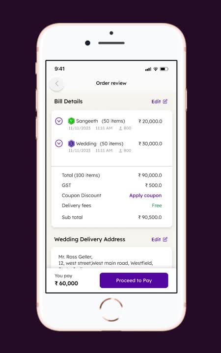
Before finalizing your order, review the details to ensure everything is correct. The order review screen shows a breakdown of the items, quantities, and total cost. You can edit the order if needed. Once you're satisfied, proceed to payment.
The payment screen allows you to pay a partial or full amount, with options to choose from various payment methods, such as cards, UPI, or wallets. Complete the payment to confirm your order.

Nailing the blueprint first saves countless redesigns later.
Usability testing is your final safety net, better catch those snags now than ship them later.
Detailed prototypes catch the subtle UX hiccups no wireframe ever reveals.
Thank you for exploring my work. I'd love to discuss how I can help with your next project