
A pioneering digital space crafted for Moleskine Smart Notebooks, fostering private, mindful sharing and connection for creatives. I led the end-to-end UX/UI design, building a safe, intuitive platform to celebrate process over perfection.


Lead UX/UI Designer, Research & Strategy Lead
Grace Vassallo (Co-designer & Research Lead),
Vasuki Senguttuvan (Co-designer & UI Lead),
Moleskine Stakeholders (conceptual project)
2 Weeks
Figma (design & prototyping),
FigJam,
Zoom,
Slack,
Google Docs
Every time I cracked open my Moleskine notebook, I felt inspired until I tried sharing my sketches online and hit the wall of “perfect-post” pressure. To bridge that gap, my teammates (Grace and Vasuki) and I dreamed up Smart Share: a privacy-first social feature for Moleskine Smart Notebooks that feels like a trusted sketchbook, not a crowded stage.
This feature seeks to serve artists, writers, designers, and dreamers by creating a safe and inspiring space to share, reflect, and grow, without the performance pressure of traditional social platforms
Co-authored the vision for a low-pressure, hybrid (paper + digital) sharing space
Led competitive analysis to spot white-space in existing creative platforms
Designed and moderated interviews with seven diverse creatives
Translated emotional insights into problem statements, design principles, and prototypes
Creative minds crave connection but on standard platforms:
Sharing feels like a performance, not a conversation. Burdened by branding, metrics, and perfectionism.
Fear of judgment stifles honest work-in-progress posts
No control over who sees your sketches
Hybrid paper-to-pixel workflows remain clumsy
Smart Share is a gentle social network inside your Moleskine Smart app, built around mindful creation, not metrics.
Upload sketches at your own pace, public, private, or to a small circle
Tag each piece with mood, context, or tools used
A timeline of your creative journey, WIP to masterpiece
Gentle feedback prompts (“I’m curious…”), or silent “appreciations”
One-tap smart-pen scans that bridge paper and digital
Discovery by theme or feeling, no follower counts in sight
Boosting Engagement by driving frequent, low-pressure engagement, encouraging more consistent use of the app and smart notebooks.
Fueling Adoption, increasing sales and ecosystem adoption by positioning Moleskine as a unique digital creative home.
Growing Brand Loyalty by fostering deep emotional connections, making Moleskine not just a tool, but a supportive community.
Inspiring User-Generated Content (UGC) by encouraging authentic sharing, turning personal creations into organic marketing and inspiration for others.
Clear & Safe Sharing
Users need a platform where they can share freely, feeling safe and in control of who sees their vulnerable work.
Meaningful Feedback
They crave kind, thoughtful feedback that encourages growth, not judgment or negativity.
Process & Reflection
Users want to track their creative journey, reflecting on progress and archiving emotionally significant work
Kind Community
They yearn for a supportive, like-minded creative community that values genuine connection over popularity.
Seamless Hybrid Flow
Users need effortless transition between physical notebooks and digital tools.
Brand Loyalty
Position Moleskine as a community builder, not just a product manufacturer.
Ecosystem Adoption
Encourage users to invest in Smart Notebooks and Pens by offering unique social value.
UGC Engine
Generate authentic user content that inspires purchases and organic growth.
I embarked on a “safari” through the digital jungles of Behance, Instagram, Pinterest, and Reddit. I meticulously analyzed how these platforms handled sharing, feedback, privacy, and discovery. My heart sank a little seeing how often "exposure" trumped "intimacy."
Every feed shouted "go big or go home." None whispered "find your circle." This cemented my conviction that our unique value lay in celebrating process over perfection.
This was my favorite part: sitting down (virtually) with seven diverse creatives. I designed semi-structured interviews, gently guiding them from daily habits to deepest anxieties. Their vulnerability was astounding.
What They Heard & Saw:
They perceived a "competitive world to post and get likes," seeing "other artists chasing algorithm success" and "polished, branded art." Many felt "discouraged by harsh or empty feedback."
What They Heard & Saw:
They sought tools for "emotional depth," not just speed. They felt "vulnerable when sharing emotionally honest work," yet recognized "emotion connected with creating." Many shared, "Drawing helps me shift my mood," and "When I look back at my old artwork, I remember exactly what I was feeling or doing at that time."
What They Heard & Saw:
I don’t want to share unless I feel safe." They often used "stylus-enabled phones as they bridge the gap between paper and digital." They were encouraged by "good feedback from people with similar interests" but worried about "nasty comments." They actively "look up on apps to find inspirations." Many "prefer to share a finished piece" but "would only share unfinished work if that's what the community was for." Some valued anonymous sharing: "Maybe an anonymous app. It’s all about the work."
We meticulously extracted every "I statement" and grouped them into core themes.
Pains
Included fear of judgment ("I get demotivated by negative comments"), lack of control ("I worry about negativity online and feels exposed"), impersonal feedback, and feeling overwhelmed by social media upkeep ("I find that social media takes too much effort to maintain").
Gains
A platform where they could safely express themselves, receive meaningful feedback ("I feel encouraged to share when getting good feedback"), control visibility, and experience growth through reflection.
Motivations
Included fear of judgment ("I get demotivated by negative comments"), lack of control ("I worryJoy, emotional release, and personal expression were paramount ("I create things for the joy of it"), not external validation ("I don’t need validation and not interested in public opinion"). about negativity online and feels exposed"), impersonal feedback, and feeling overwhelmed by social media upkeep ("I find that social media takes too much effort to maintain").
Armed with countless quotes, we virtually "sticky-noted" our findings in FigJam. We grouped related thoughts, creating clusters that naturally formed into themes. My heart swelled as abstract data transformed into clear categories like "Fear of Judgment," "Desire for Reflection," and "Need for Control." This also flowed into empathy mapping, where we literally stepped into our users' shoes, imagining what they think, feel, say, and do when they create and share.
This process revealed the overwhelming desire for a safe, low-pressure sharing environment where vulnerability is okay, and reflection is encouraged.
From our empathy maps and deep user insights, we distilled our findings into concise problem statements the clear challenges we set out to tackle, each translated into a "How Might We" question:
Effortless sharing & safety, users need a low-effort, intuitive way to share work while feeling emotionally safe and in control. They want to control who sees their work and when, and be protected from negative feedback and judgment.
Meaningful feedback & community, users crave purposeful feedback that improves their work and want to be part of a kind, like-minded community that values process over perfection. They need spaces to share unfinished work and receive thoughtful feedback.
Personalized experience & reflection, users want a mobile-first experience that supports their creative workflow, allowing them to seamlessly transition between paper and digital tools, archive their work with personal notes, and revisit their creations to reflect on their personal meaning.
These principles became our unwavering compass, ensuring every pixel and interaction aligned with Moleskine's ethos and user needs:
Emotional Expression, design to capture the feeling behind the art.
UX Implication: Mood tags, private reflection tools
Thoughtful Connection which fosters intimacy, not just reach.
UX Implication: Small circles, anonymous options.
Freedom & safety, empowering users to share on their terms.
UX Implication: Flexible visibility, comment filters.
Celebrate the journey, not just the destination.
UX Implication: In-progress badges, story timelines.

We knew naming was crucial. "My Gallery" felt too public, "My Portfolio" too professional, "Notes" too boring. Through card sorting, we tested names for personal spaces and navigation:
User Findings:
"My Work" was broadly understood but bland. "Journal" felt safe but too text-focused. "Reflections" resonated emotionally but wasn't comprehensive.
Our Solution:
A balanced global navigation that celebrated both personal and communal aspects: My Work (for all personal creations), Inspiration (a discovery hub), Explore (community creations), Journal (private thoughts), and Circles (intimate groups). This structure directly reflected Monica's need for personal space and selective sharing.
To truly solve these problems, we needed a guiding light. We found her in Monica Gately, a 27-year-old freelance illustrator and art teacher in London. Monica became our north star, she’s like so many Moleskine users: thoughtful, creative, and uses art to reflect and process emotions.
I sketched a story to empathize with Monica’s emotions on her journey


She perfectly embodies what's missing in other apps: the need for genuine connection over superficial likes. She inspires features for private sharing, gentle feedback, and emotional safety. Her journey reflects Moleskine’s core values of personal meaning, guiding us to create a kinder platform for all.
Our Solution:
We meticulously mapped Monica's core journeys within the app, like her process for sharing an emotional sketch. This wasn't just about flowcharts; it was about imagining her emotional state at each point, striving for minimal friction.The
Journey (Example: Sharing an Emotional Sketch):
Draws: Monica completes an emotional sketch in her Smart Notebook.
Uploads: She opens the Moleskine app, selects the sketch (via Smart Pen scan or device).
Adds Context: Monica tags the emotion ("Anxiety"), adds a private note about her process, and chooses a "sensitive piece" visual cue.
Sets Visibility: She decides to share it with her "Trusted Circle," selecting "no public metrics" and "filtered comments."
Receives Feedback: A friend from her circle responds not with words, but with a thoughtful sketch, gently echoing Monica's theme.
Reflects: Monica saves the exchange to her private "Growth Journal."
A consistent design system isn't just about pretty pixels; it's about building trust, reducing cognitive load for users, and streamlining development
Typography, Iocnography, Grids, Button hierarchy we are going with existing design system. We have woked on the colour theory to come up with the below splash of pruple to march the brand principles of luxury and creativity.

With our blueprint set, I sketched wireframes in Figma, focusing purely on layout and flow. My goal was to map out how users would upload a sketch, set its visibility, and add context. An early realization: crucial privacy controls weren’t prominent enough, to test the core information hierarchy and user flow rapidly, before diving into visual details.Users instinctively look for privacy settings before they upload. A quick redesign made visibility options prominent from the first screen.
Below are some of the rough sketching we generated during our brainstorm secession, getting the UI ideas brom brain to paper or tab can be messy but only adesigner can undertsand, if u wish to talk more on below reach out fr a virtual coffee!


We set up a rigorous usability test, ensuring a comfortable environment: "We’re testing the product, not you. Please think out loud." We even invited stakeholders to observe, fostering empathy for our users.
Test Participants: Our 15 testers included a mix of creative educators, freelance designers, architecture students (sketch-heavy users), and hobby artists, a diverse group reflecting our target audience.
Moderated Testing Tasks:
Task 1: Save a Sketch Privately: "Save a personal sketch you don’t want to share yet."
Task 2: Share to Public or Private Group: "Share an emotional sketch to get feedback."
Task 3: Save Comment to Journal: "Find a response and save it to your journal/gallery."
What Worked Well
Users appreciated having control over visibility and comments, feeling more secure in their interactions.
Saving creative responses felt meaningful and encouraging, while quiet interactions like "thanks" or replying with a drawing were refreshing.
The app's concept resonated with everyone, offering a unique and positive reflective experience.
Top Priorities to Fix
Users appreciated having control over visibility and comments, feeling more secure in their interactions.
The journal layout was confusing, leaving users uncertain of its purpose, while the "comment screening" option was not well understood.
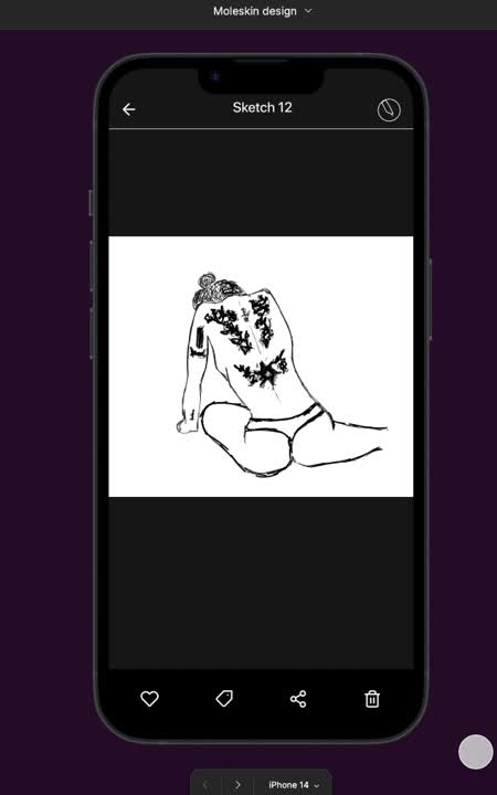
The Moleskine Smart Share project was a journey into the heart of creative expression, where art meets emotion, and technology meets humanity. The image represents a partial flow of the app's screens, showcasing the seamless process of sharing a sketch, from upload to publication, with a focus on control, safety, and community.
As seen in the image, the user can upload a sketch, add context through emotional tags, and choose to share it with a trusted circle or keep it private. This intuitive flow is designed to reduce friction and empower creators to share their work on their own terms.

The final prototype delivered to the development team was the culmination of extensive user research, design iterations, and usability testing. Through this process, we crafted a digital sanctuary that not only honors the Moleskine legacy but also redefines the way artists connect, share, and grow.
Design should build trust and control, not just follow policies. I realized how much design affects people's feelings.
It’s not just about making things work, designing with mood, memory, and meaning helps users feel more connected. That’s why I love UI/UX creating experiences that touch people emotionally.
Sometimes quiet, meaningful connections are more engaging than chasing trends. This project reminded me that design should meet real human needs, not just follow fads.
Thank you for exploring my work. I'd love to discuss how I can help with your next project


