
Tradestars is a private studio provider struggling with low conversion rates despite high mobile traffic from paid ads. I co-led a full-cycle redesign to clarify their value proposition, improve mobile usability, and increase conversions.


Product Designer
UX UI designers,
Content designer,
Marketting manager,
CEO (Stakeholder),
Developers,
SEO specialist
2 Weeks
Figma,
Google Analytics,
Maze,
Microsoft Forms,
Google Docs
Tradestars is a platform offering private studio rentals primarily for creatives and professionals seeking flexible, long- and short-term spaces. Despite high Google ad traffic, their existing website struggled with low conversion rates, visitors clicked ads but dropped off without booking or inquiry.
We were tasked with redesigning the Tradestars website to improve user clarity, trust, and conversion. This real client project challenged us to deeply understand user needs, competitor offerings, and identify friction points in the user journey. Our goal: transform visitors into confident bookers by enhancing the website’s clarity, usability, and emotional connection
Delivered annotated prototypes, developer handoff docs, and a content/SEO brief
Led high-fidelity prototyping and design system clean-up for handoff
Improved clarity of CTAs, contact pathways, and studio discovery experience
When users clicked on Tradestars’ Google Ads, they landed on a homepage that didn’t immediately answer their questions. The site’s value proposition was unclear, booking flows were complicated, and users felt pressured to commit without adequate information or support. These issues led to high drop-off rates and missed revenue opportunities.How might we redesign Tradestars’ digital experience to clearly communicate their offerings, simplify the booking process, and build trust especially for first-time visitors unsure about renting private studios
Book a Tour Flow
Projected 28–35% increase in lead conversions (based on usability testing)
Reduced inquiry steps from 6+ to 3
100% of users recognized the value offering post-redesign
Received positive feedback from client stakeholders for clarity and usability
I use AI tools to enhance my creativity and productivity, not to replace human insight or empathy in design.
I Prioritize human needs, accessibility, privacy, inclusivity, and fairness in all AI-assisted design
I am open about AI use and committed to continuously learning as AI technology advances.
AI is a creative partner; human intuition (Ofcourse driven by research) and responsibility guide all final design decisions.
Focused on final UI/UX refinements during the last two weeks of the project
Led high-fidelity prototyping and design system clean-up for handoff
Improved clarity of CTAs, contact pathways, and studio discovery experience
Delivered annotated prototypes, developer handoff docs, and a content/SEO brief
Began with competitor Analysis,
We mapped out the main players across two axes: private vs shared and creative vs corporate. This helped us see who’s dominating flexible coworking, who’s serving niche artists, and where Tradestars can own space as a dedicated private studio platform without hot desks or hustle culture.


We reviewed each competitor’s studio offering, pricing, features, and brand tone, then broke down what they’re doing well, like community vibes or sleek design, where they’re falling short, like clunky booking or unclear messaging, and how Tradestars can stand out with clarity, ease, and trust.

We stepped through key booking journeys from homepage to enquiry for each competitor. Some made it quick and easy to get in touch or filter by size and price. Others buried the form or skipped key info. For Tradestars, this confirmed the need for a simple, mobile-first flow with helpful filters and a clear next step.

Key Takeaways
Tradestars fills a clear market gap: private creative studios without hot desks or corporate culture.
Competitors struggle with clarity and conversion: many have cluttered sites, unclear messaging, and buried booking flows.
Top performers win with authenticity: strong communities, branding, and social proof build trust.
Key opportunities for Tradestars: simplify booking, clarify value, highlight testimonials, and offer a premium-yet-personal experience.

We began by immersing ourselves in Tradestars’ product and market context: what kinds of studios are offered, who the target users are, and what competitors do better.
Competitive research revealed smoother booking flows and clearer studio categorizations on rival sites.
Google analytics and ad data showed that landing on the homepage post-ad click wasn’t effective.
We created and distributed a survey targeting existing and potential users to gather quantitative data on their booking motivations and pain points.
Through user interviews and usability testing, we gathered rich qualitative insights about user confusion over studio types, unclear pricing, and lack of low-pressure contact options.
Affinity mapping and journey mapping crystallized key frustrations, such as difficulty navigating listings and uncertainty about booking commitment.

By immersing myselves in the user's perspective, I synthesized their sensory inputs, internal monologues, emotional states, spoken feedback, and observed actions. This revealed their core pain points, such as distrust of contact forms and frustration with vague information, and highlighted key opportunities to build trust and deliver essential details

I mapped the end-to-end journey from initial ad click to booking a tour, identifying every action, thought, and feeling. This revealed critical moments of confusion and frustration where users got sidetracked or gave up. By understanding their existing struggle, I pinpointed exactly where to introduce clarity and support to ensure a smoother path to conversion.


Organisation
Prioritization
Navigation
Fixed fragmented site structure Card sorting Created sitemap Content audit
Armed with insights, we crafted “How Might We” statements to target specific problems, like improving trust signals and offering softer booking options.
We sketched multiple solutions on paper, redesigning the homepage layout, refining studio listing cards, and simplifying the booking flow. We prioritized features using an impact-effort matrix to focus on high-value fixes.
Concepts included:
Clearer value propositions with outcome-driven language
Adding an “Enquire” option alongside “Book a Tour” for low-commitment contact
More intuitive filters and visual cues in studio listings
Bild Trust with users
We collaborated closely to select ideas that best aligned with user needs and business goals.


To avoid guesswork and stay aligned as a team, we mapped all brainstormed ideas onto an Impact vs. Effort matrix. This helped us identify high-value, low-effort features we could act on immediately to improve clarity and conversions.
Quick Wins First: Features like better form feedback, homepage clarity, and rental period info offered the highest return with minimal lift, ideal for early implementation.
Confidence in Direction: Visualising effort vs. impact helped align the team and client on realistic priorities.
Keeps Scope Grounded: This process helped us say no to flashy but low-impact or high-effort ideas that wouldn’t serve our core users or goals

Conducted sketching workshop to quicky shape our ideas on paper and pen using Crazy 8's keeping our features, HMW, problem statements on our mind. What we are trying to solve and how we are going to solve it.
Team of 5 designers came together along with the stakeholder I conducted this workshop and below are some of the sketches flowing with wonderful ideas. After which we quickly moved to home page redesign sketches.

Focussed on

We conducted usability tests on our mid-fidelity prototypes to validate if changes improved clarity and trust. And conducted A/B testing on our space listing cards to test which helps the users better in making a decision to move to next steps.
Below is the Mid-Fi prototype used for testing:
Key Findings
Users easily understood the main site structure and CTAs like Browse Studios, but elements like the search bar and similar button labels (“View” vs. “Browse”) caused confusion. Mobile layout felt too dense.
While users appreciated FAQs and footer contact info, the dominant “Book a Tour” CTA felt too committal. Many wanted a simpler way to ask questions without having to book.
Users felt confident in the platform thanks to clear branding, professional design, testimonials, reviews, and recognizable client logos. The offer of private studios—not coworking—came across clearly, helping reinforce the value proposition.
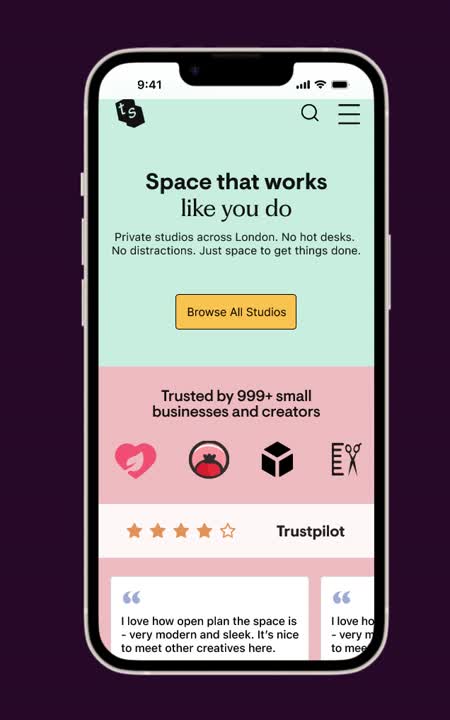
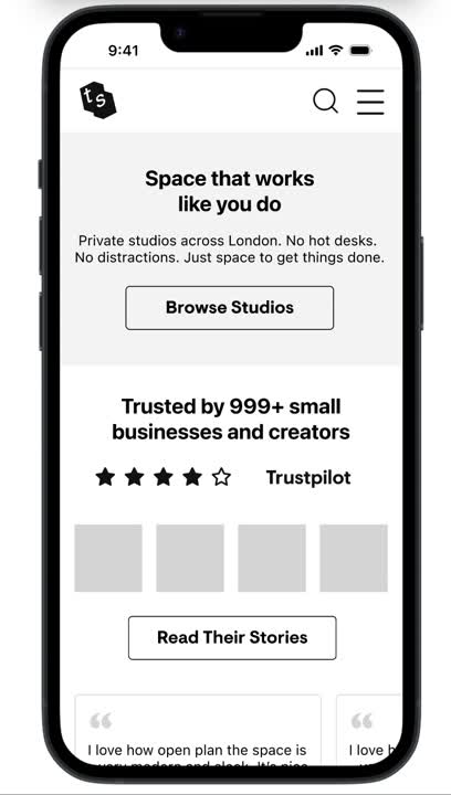
The provided images show the Homepage in its original state and its updated version. These changes have been implemented based on user feedback and the business's strategic objectives.


In enhancing the "Have Questions, Ready to Explore, and FAQs" sections, the focus was on improving navigation and immediate access to information.
By organizing FAQs into expandable sections and adding clear call-to-action buttons, users can easily find answers and take the next steps without hassle, thereby improving their overall experience and increasing engagement.

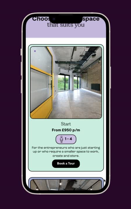
The redesign of the "How It Works" section aimed to provide a user-friendly overview that breaks down the process into clear, digestible steps.
By using concise language and intuitive visuals, we help users quickly grasp the value proposition and streamline their decision-making process.
I learnt the value right context that triggers different emotions which combined with user’s mental models make a meaningful journey. Effortless to read, understand and navigate.
Mobile-first design forces simplicity and accessibility. It's easier to scale from mobile to web than the other way around, making it the smarter approach.
Working closely with different teams taught me how important collaboration is to make sure designs are practical and can be built smoothly.
Created and tested rest of the flow and designed hi-fid pages for studio library (Browse All), pricing plan, About Us, and more.
Created more accessible component library, update deisgn system to WCAG accessibility standards
Tested other segments of IA and content audit, and created a Service blueprint with a more holistic view of the journey
Thank you for exploring my work. I'd love to discuss how I can help with your next project